
Customize the layout
We support PIP (picture-in-picture), gallery and magic layouts. You can achieve your desired layout by setting the config.layout parameter.
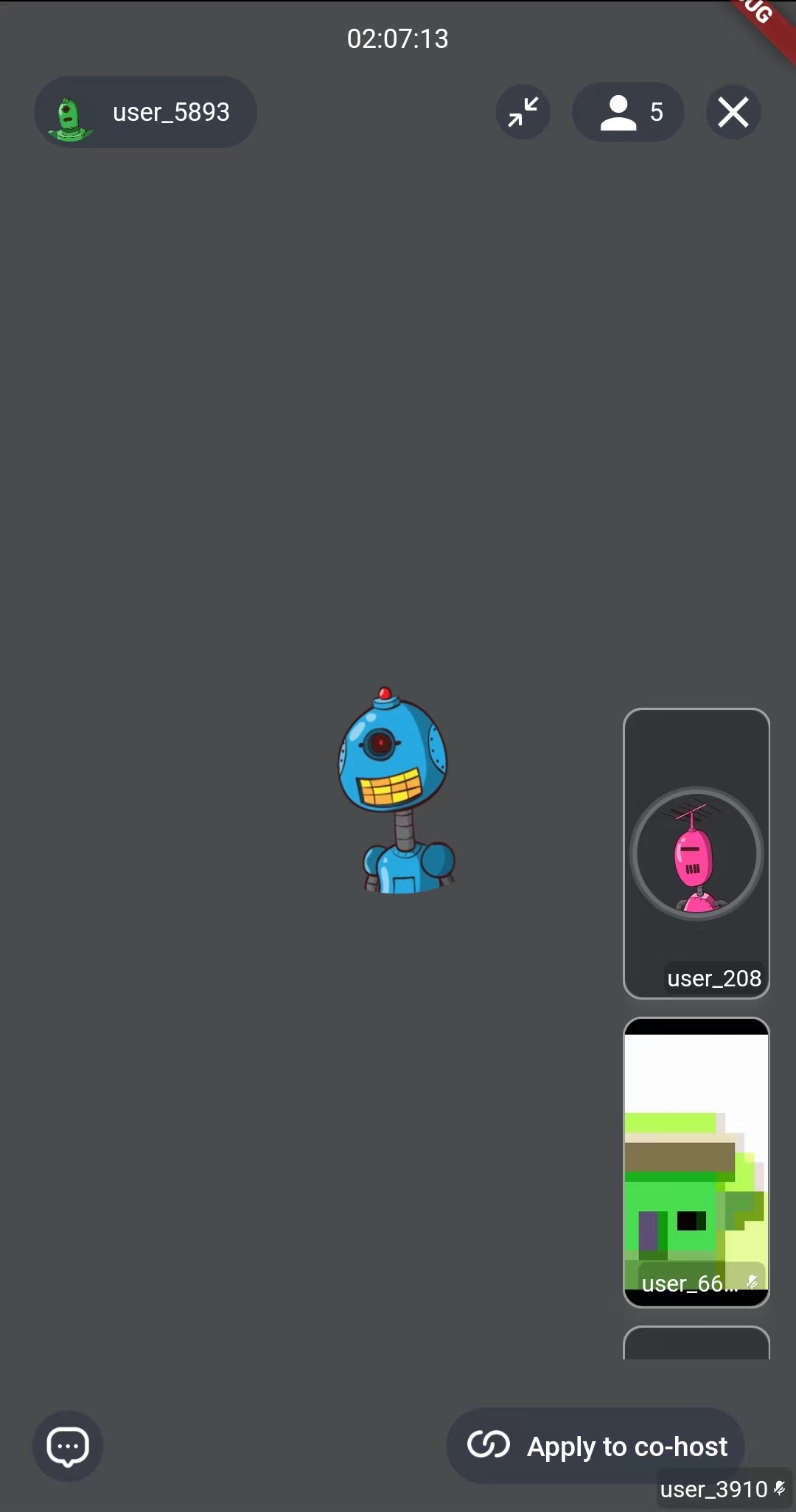
Picture In Picture
By setting layout = ZegoLayout.pictureInPicture(), you can configure the layout as PIP (Picture-in-Picture), and we also provide some parameters for customization.
Here, we set the PIP view to be displayed in the bottom right corner, scrollable, and with a maximum of 2 view elements.
class LivePage extends StatefulWidget {
  final String liveID;
  final bool isHost;

  const LivePage({
    Key? key,
    required this.liveID,
    this.isHost = false,
  }) : super(key: key);

  @override
  State<StatefulWidget> createState() => LivePageState();
}

class LivePageState extends State<LivePage> {
  @override
  Widget build(BuildContext context) {
    return SafeArea(
      child: ZegoUIKitPrebuiltLiveStreaming(
        appID: yourAppID /*input your AppID*/,
        appSign: yourAppSign /*input your AppSign*/,
        userID: 'userID',
        userName: 'userName',
        liveID: widget.liveID,
        config: (widget.isHost
            ? ZegoUIKitPrebuiltLiveStreamingConfig.host(
                plugins: [ZegoUIKitSignalingPlugin()],
              )
            : ZegoUIKitPrebuiltLiveStreamingConfig.audience(
                plugins: [ZegoUIKitSignalingPlugin()],
              ))
          ..layout = ZegoLayout.pictureInPicture(
            smallViewPosition: ZegoViewPosition.bottomRight,
            isSmallViewsScrollable: true,
            visibleSmallViewsCount: 2,
          ),
      ),
    );
  }
}
Parameters description of ZegoLayout.pictureInPicture
common
-
EdgeInsets?
smallViewMargin: the margin of PIP view. -
Size?
smallViewSize: the size of every small view. -
ZegoViewPosition
smallViewPosition: whether to hide the local View when the local camera is closed, default is ZegoViewPosition.topRight. -
bool
switchLargeOrSmallViewByClick: whether you can switch view's position by clicking on the small view, default is true.
one-on-one
- bool
isSmallViewDraggable: small video view is draggable if set true in one-on-one mode, default is true.
multi users
-
EdgeInsets?
spacingBetweenSmallViews: the space/paddings between small views in multi-users mode -
bool
isSmallViewsScrollable: small video views is scrollable if set true in multi-users mode, default is true. -
int
visibleSmallViewsCount: the visible small views count in multi-users mode, if the value is set to -1, it will attempt to display the maximum number of views, default is 3.
screen-sharing
-
bool
showNewScreenSharingViewInFullscreenMode: default is true. -
ZegoShowFullscreenModeToggleButtonRules
showScreenSharingFullscreenModeToggleButtonRules: display rule of full screen button, default is ZegoShowFullscreenModeToggleButtonRules.showWhenScreenPressed.
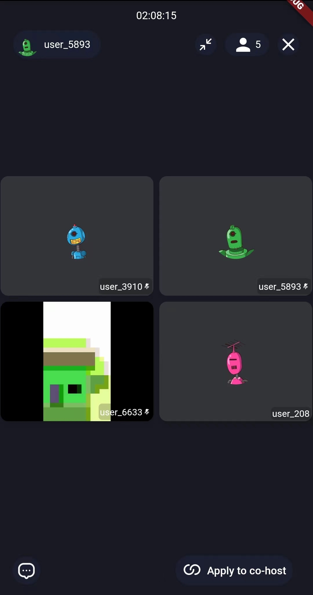
Gallery
By setting layout = ZegoLayout.gallery(), you can set the layout to Gallery and we also provide some parameters for customization.
Here, in order to display custom widgets around the video, you can set the height margin to 200(just an example number, might be better to dynamically set it, such as 1/4 of the screen height), so that the Gallery view will have enough space for display.
class LivePage extends StatefulWidget {
  final String liveID;
  final bool isHost;

  const LivePage({
    Key? key,
    required this.liveID,
    this.isHost = false,
  }) : super(key: key);

  @override
  State<StatefulWidget> createState() => LivePageState();
}

class LivePageState extends State<LivePage> {
  @override
  Widget build(BuildContext context) {
    return SafeArea(
      child: ZegoUIKitPrebuiltLiveStreaming(
        appID: yourAppID /*input your AppID*/,
        appSign: yourAppSign /*input your AppSign*/,
        userID: 'userID',
        userName: 'userName',
        liveID: widget.liveID,
        config: (widget.isHost
            ? ZegoUIKitPrebuiltLiveStreamingConfig.host(
                plugins: [ZegoUIKitSignalingPlugin()],
              )
            : ZegoUIKitPrebuiltLiveStreamingConfig.audience(
                plugins: [ZegoUIKitSignalingPlugin()],
              ))
          ..layout = ZegoLayout.gallery(
            margin: const EdgeInsets.all(200),
          ),
      ),
    );
  }
}
Parameters description of ZegoLayout.gallery
common
-
EdgeInsetsGeometry
margin: the margin of layout, the layout will display center, so you can display your widgets around empty spaces, default is const EdgeInsets.all(2.0), -
bool
addBorderRadiusAndSpacingBetweenView: whether to display rounded corners and spacing between views, default is true.
screen-sharing
-
bool
showNewScreenSharingViewInFullscreenMode: default is true -
ZegoShowFullscreenModeToggleButtonRules
showScreenSharingFullscreenModeToggleButtonRules: display rule of full screen button, default is ZegoShowFullscreenModeToggleButtonRules.showWhenScreenPressed.
'ZegoShowFullscreenModeToggleButtonRules' is defined as follows:
/// Specifies the rules for showing the fullscreen mode toggle button.
enum ZegoShowFullscreenModeToggleButtonRules {
  /// The fullscreen mode toggle button is shown when press the the video widget.
  showWhenScreenPressed,

  /// The fullscreen mode toggle button is always shown.
  alwaysShow,

  /// The fullscreen mode toggle button is always hidden.
  alwaysHide,
}
Magic Layout
If the layout we provide does not meet your needs, you can redefine the entire layout through containerRect and containerBuilder in ZegoUIKitPrebuiltLiveStreamingConfig.audioVideoView.
The code prototype is as follows:
typedef ZegoLiveStreamingAudioVideoContainerBuilder = Widget? Function(
  BuildContext context,
  List<ZegoUIKitUser> allUsers,
  List<ZegoUIKitUser> audioVideoUsers,
  ZegoAudioVideoView Function(ZegoUIKitUser) audioVideoViewCreator,
);
/// Custom audio/video view. ( not for PK!! )
/// If you don't want to use the default view components, you can pass a custom component through this parameter.
/// and if return null, will be display the default view
ZegoLiveStreamingAudioVideoContainerBuilder? containerBuilder;

/// Specify the rect of the audio & video container.
/// If not specified, it defaults to display full.
Rect Function()? containerRect;
Here are three examples: